
Unleashing the Power of Infographic Design: Visual Storytelling Made Engaging and Effective
Infographic Design: The Power of Visual Storytelling
In today’s fast-paced digital world, where information overload is a constant challenge, capturing and retaining audience attention has become increasingly difficult. This is where the power of infographic design comes into play. Infographics have emerged as a highly effective tool for conveying complex information in a visually appealing and easily digestible format.
What exactly is an infographic? It’s a visual representation of data, knowledge, or ideas that combines text, images, and illustrations to tell a story or present information in a concise and engaging manner. Infographics leverage the human brain’s natural affinity for visual content, making it easier for people to understand and remember key messages.
One of the primary advantages of using infographics is their ability to simplify complex concepts. By breaking down intricate data sets or lengthy explanations into bite-sized visual chunks, infographics make it easier for viewers to grasp the main points quickly. Whether you’re explaining scientific research findings, presenting survey results, or showcasing product features, infographics can transform dry and tedious content into an engaging narrative.
Moreover, infographics foster better retention and comprehension. Research shows that visuals are processed 60,000 times faster than text alone. By combining relevant imagery with concise text snippets, infographics engage both the visual and verbal parts of our brains simultaneously. This dual processing enhances understanding and increases the likelihood that viewers will remember the information long after they’ve seen it.
Another key benefit of infographic design is its shareability. In today’s age of social media dominance, captivating visuals are more likely to be shared across platforms than plain text. Infographics have high viral potential due to their eye-catching nature and ability to convey valuable information in a compact form. When designed effectively with brand elements incorporated seamlessly, infographics can help organizations increase their online visibility and reach new audiences.
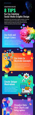
Creating an impactful infographic requires careful consideration of several design elements. First and foremost is clarity: the information should be presented in a logical and easily comprehensible manner. The use of icons, illustrations, charts, and graphs should be purposeful and visually appealing, supporting the narrative rather than overwhelming it.
Color choice is another crucial aspect of infographic design. Colors evoke emotions and can enhance the visual appeal of the content. However, it’s essential to strike a balance between vibrant hues and readability. A well-designed color palette that aligns with the brand’s identity can create a cohesive visual experience.
Typography plays a significant role as well. Choosing appropriate fonts that are legible at different sizes is vital for ensuring accessibility across various devices and platforms. Additionally, using hierarchy in typography helps guide viewers’ attention to the most important information within the infographic.
Lastly, an effective call-to-action (CTA) should be incorporated into the infographic design. Whether it’s encouraging viewers to visit a website, sign up for a newsletter, or share the infographic on social media, a clear CTA boosts engagement and helps achieve desired outcomes.
In conclusion, infographic design has become an indispensable tool for modern communication. By combining visuals with concise text and utilizing design principles effectively, infographics captivate audiences while simplifying complex information. They enhance understanding, improve retention rates, and have high shareability potential in today’s digital landscape. So why not harness the power of infographics to tell your story and engage your audience?
5 Key Benefits of Infographic Design: Boosting Engagement, Enhancing Comprehension, Creating Shareable Content, Amplifying Brand Recognition, and Driving Traffic
- Increased Engagement
- Improved Comprehension
- Shareable Content
- Enhanced Brand Recognition
- Increased Traffic
6 Cons of Infographic Design: Challenges and Limitations to Consider
- Infographics can be difficult to interpret if not designed properly.
- Complex data may not be suitable for infographic design and may require a more traditional format like tables or charts.
- Infographics can be time consuming to create and may require specialist skills in graphic design and data visualization.
- They can also be costly, depending on the complexity of the project and the size of the team involved in creating them.
- If not carefully planned, infographics can become too cluttered with information or visuals that detract from their overall message.
- Infographic designs are often limited by size constraints, making it difficult to include all relevant information within a single visual element or page layout
Increased Engagement
Increased Engagement: Infographics Capture Attention and Foster Interest
In a world flooded with information, capturing and maintaining audience attention is a constant challenge. This is where the power of infographic design shines through. One significant advantage of using infographics is their ability to draw in your audience and keep them engaged with the content you are providing.
Humans are naturally drawn to visuals. Our brains process images much faster than text, making infographics an ideal medium for conveying information in a visually appealing manner. By combining relevant imagery, icons, and illustrations with concise text snippets, infographics create a captivating visual narrative that grabs attention right from the start.
The use of colors, fonts, and design elements in infographics further enhances their engagement potential. Vibrant colors attract the eye and evoke emotions, while well-chosen fonts ensure readability across different devices and platforms. When designed effectively, infographics create a cohesive visual experience that entices viewers to explore the content further.
Moreover, infographics break down complex concepts into easily digestible chunks. By presenting information in a clear and logical manner, they make it easier for viewers to grasp key messages quickly. This simplicity not only enhances understanding but also encourages active participation from the audience.
Infographics also have high shareability potential in today’s digital landscape. With social media platforms dominating our online interactions, captivating visuals are more likely to be shared than plain text alone. When your audience finds value in your infographic content, they are more inclined to share it with their networks, extending your reach and potentially attracting new audiences.
By leveraging the power of infographic design to increase engagement, you can effectively communicate your message or promote your brand. Whether you’re presenting data-driven insights or explaining complex processes, infographics have the ability to captivate viewers’ attention and keep them interested throughout the entire experience.
So if you want to stand out in a sea of information overload and connect with your audience on a deeper level, consider incorporating infographics into your content strategy. With their visually appealing nature and ability to simplify complex ideas, infographics are a powerful tool for increasing engagement and fostering meaningful connections with your target audience.
Improved Comprehension
Improved Comprehension: Unlocking the Power of Infographic Design
In a world overflowing with information, capturing and retaining attention has become an uphill battle. When it comes to explaining complex topics, traditional methods often fall short. This is where the power of infographic design shines through, offering a solution that improves comprehension and enhances understanding.
Infographics have emerged as a game-changer in the realm of communication. By utilizing visuals to explain intricate concepts, they break down barriers and make even the most convoluted subjects accessible to a wider audience. Instead of drowning in lengthy explanations or overwhelming data sets, viewers can now grasp key messages with ease.
But how exactly do infographics achieve this feat? The answer lies in their ability to simplify complex information into visually digestible chunks. By combining concise text with relevant images, illustrations, charts, and graphs, infographics transform daunting content into an engaging narrative that is easy on the eyes and mind.
The human brain has an innate affinity for visual content. Research suggests that visuals are processed 60,000 times faster than plain text alone. Infographics tap into this natural inclination and leverage it to their advantage. By presenting information in a visually appealing format, they engage both the visual and verbal parts of our brains simultaneously. This dual processing enhances comprehension and facilitates better retention.
Moreover, infographics provide a clear structure that guides viewers through the content in a logical sequence. They eliminate unnecessary noise and distractions while highlighting essential points using color coding or visual hierarchy. This organized approach ensures that viewers can follow along effortlessly without feeling overwhelmed or confused.
Another benefit of infographics is their ability to convey complex relationships or comparisons effectively. Through the strategic use of visuals such as diagrams or flowcharts, intricate connections between various elements become apparent at a glance. This visual storytelling enables viewers to grasp complex concepts quickly and understand how different pieces fit together.
Infographic design also encourages active engagement from viewers. The combination of visuals and concise text prompts curiosity and invites exploration. Viewers are more likely to invest their time and attention when presented with an infographic that offers a visually stimulating experience. This engagement further enhances comprehension as viewers actively process the information presented.
In conclusion, the power of infographic design lies in its ability to improve comprehension. By utilizing visuals to explain complex topics, infographics make it easier for viewers to understand and retain information. They simplify intricate concepts, provide a clear structure, highlight relationships, and foster active engagement. So next time you encounter a challenging subject that needs explaining, consider harnessing the power of infographics to unlock better comprehension for your audience.
Shareable Content
Shareable Content: Infographics as Viral Catalysts
In today’s interconnected world, the ability to share information quickly and effectively is paramount. This is where the power of infographic design truly shines. One of the key advantages of using infographics is their inherent shareability, enabling you to spread your message far and wide with ease.
Infographics have a unique ability to capture attention and engage viewers through their visually appealing and informative nature. Their eye-catching design, combined with concise text and relevant imagery, makes them highly shareable across various platforms, including social media, websites, blogs, and email newsletters.
Social media platforms thrive on visual content that grabs users’ attention as they scroll through their feeds. Infographics are tailor-made for this purpose. They provide a condensed yet comprehensive snapshot of information that can be easily consumed and shared within seconds.
When an infographic catches someone’s eye on social media, they are more likely to engage with it by liking, commenting, or sharing it with their own network. This organic sharing can lead to a ripple effect as others in their network see the infographic and continue the cycle of sharing.
The viral potential of infographics lies in their ability to convey valuable information in a visually appealing manner. People are naturally drawn to visuals that are aesthetically pleasing and informative at the same time. By creating infographics that resonate with your target audience’s interests or pain points, you increase the likelihood that they will be shared across various platforms.
The shareability factor of infographics also extends beyond social media. Websites and blogs often feature infographics as standalone pieces or embedded within articles to enhance the reader’s experience. Sharing an infographic on your website not only provides valuable content for your visitors but also encourages them to share it with others who may find it useful or interesting.
Moreover, infographics can be easily incorporated into email newsletters to engage subscribers and encourage them to forward the content to their contacts. This creates a snowball effect, expanding your reach and increasing the chances of your message reaching new audiences.
When designing an infographic with shareability in mind, it’s essential to consider the platform and audience you are targeting. Tailoring the content, design, and messaging to resonate with your intended audience increases the likelihood of them engaging with and sharing the infographic.
In conclusion, the shareability of infographics is a powerful advantage that can help you quickly spread your message far and wide. By leveraging their visually appealing nature and concise information delivery, infographics have the potential to go viral on social media platforms, websites, blogs, and email newsletters. So why not harness this power to amplify your message and reach new audiences? Create compelling infographics that captivate viewers and watch as they effortlessly spread across the digital landscape.
Enhanced Brand Recognition
Enhanced Brand Recognition: The Power of Infographic Design
In the vast sea of information available today, establishing a strong brand presence is crucial for businesses to stand out from the competition. Infographic design offers a unique advantage in this regard by enhancing brand recognition and creating a lasting impression on viewers.
One of the key benefits of using infographics is their ability to make your brand memorable. An attractive and well-designed infographic captures attention and engages viewers with its visually appealing elements. By incorporating your brand’s logo, colors, and other visual identity elements seamlessly into the design, you create a consistent and cohesive experience that reinforces brand recognition.
When viewers encounter an infographic that aligns with your brand’s aesthetics, they are more likely to associate it with the quality content you provide. This association builds trust and credibility, as it demonstrates that your brand invests in delivering valuable information in an engaging format.
Moreover, infographics have high shareability potential across various online platforms. When viewers find an infographic that resonates with them, they are more inclined to share it with their networks. As these infographics circulate online, your brand becomes more visible to a broader audience. Each time someone encounters and engages with your infographic, they reinforce their familiarity with your brand.
Infographic design also allows for creative storytelling opportunities that can help solidify your brand’s message in the minds of viewers. By presenting information in a visually compelling way, you can evoke emotions and leave a lasting impression on your audience. When people connect emotionally with your content, they are more likely to remember not only the information but also the brand behind it.
To maximize the impact of enhanced brand recognition through infographics, it is essential to maintain consistency across all visual elements. This includes using consistent colors, fonts, and graphics that align with your overall branding strategy. Consistency fosters recognition and reinforces your brand identity in the minds of viewers.
In conclusion, leveraging infographic design can significantly enhance brand recognition. By creating visually attractive and informative infographics that incorporate your brand’s identity, you increase the likelihood of viewers remembering your brand and associating it with quality content. The shareability and storytelling potential of infographics further amplify this effect, expanding your brand’s reach and visibility. So, embrace the power of infographic design to establish a strong brand presence and leave a lasting impression on your audience.
Increased Traffic
Increased Traffic: The Power of Infographic Design
In today’s digital age, where social media platforms reign supreme, capturing the attention of online users can be a real challenge. However, there is a powerful tool that can help you stand out from the crowd and drive traffic to your website or blog – infographic design.
One significant advantage of creating interesting infographics is their potential to increase traffic to your online platforms. When you design visually appealing and informative infographics, people are more likely to share them on social media sites like Twitter and Facebook. These platforms provide an ideal environment for content to go viral and reach a broader audience.
The shareability factor of infographics is a game-changer. When users find an infographic that resonates with them, they often feel compelled to share it with their own followers or friends. This sharing not only exposes your content to a larger audience but also acts as a recommendation or endorsement from the person sharing it. As a result, your website or blog gains visibility and attracts new visitors who are interested in the topic presented in the infographic.
Moreover, infographics have the potential to generate backlinks to your website. When other websites or blogs find your infographic valuable and relevant to their content, they may choose to embed it on their own pages while providing proper credit and linking back to your site. These backlinks not only contribute to driving traffic directly from other websites but also improve your search engine rankings, making it easier for people to discover your content through organic searches.
To maximize the impact of infographics on increasing traffic, it’s crucial to create compelling visuals that resonate with your target audience. Focus on selecting relevant data or information that will capture their interest and provide value. Incorporate eye-catching design elements such as icons, illustrations, and color schemes that align with your brand identity.
Additionally, make sure your infographic includes clear branding elements such as logos or website URLs so that viewers can easily identify the source and visit your website for more information. Including a call-to-action within the infographic, such as encouraging viewers to explore related articles or sign up for your newsletter, can also help convert traffic into engaged users.
In conclusion, harnessing the power of infographic design can significantly contribute to increased traffic to your website or blog. By creating visually appealing and informative infographics that resonate with your target audience, you encourage social media sharing and generate valuable backlinks. So, invest in compelling infographic designs and watch as your online presence grows, attracting new visitors and expanding your reach.
Infographics can be difficult to interpret if not designed properly.
While infographics are powerful tools for visual storytelling and conveying complex information, they can also pose challenges if not designed with care. One of the main drawbacks of infographics is their potential to become confusing or misleading when design principles are not followed effectively.
When designing an infographic, it’s crucial to strike a balance between aesthetics and clarity. If the design becomes overly complex or cluttered, it can overwhelm viewers and hinder their ability to understand the intended message. Too much information or excessive visual elements can create cognitive overload, making it difficult for viewers to extract the key takeaways.
Another common pitfall is the misuse of data visualization techniques. Infographics often incorporate charts, graphs, and diagrams to present data in a visually appealing way. However, if these visual representations are not accurately constructed or lack proper labeling and context, they can mislead viewers or distort the information being conveyed. It’s essential to ensure that data is accurately represented and that visual elements align with best practices for effective communication.
Typography also plays a significant role in infographic design. Poor font choices or inadequate hierarchy can make it challenging for viewers to read and comprehend the content. Legibility should be prioritized, ensuring that fonts are clear at different sizes and accessible across various devices.
Furthermore, inadequate organization and flow within an infographic can impede understanding. Information should be logically structured and presented in a sequential manner that guides viewers through the narrative. Without proper organization, viewers may struggle to follow the intended story or grasp the main points being conveyed.
Lastly, insufficient attention to accessibility considerations can limit the effectiveness of an infographic. Design choices should accommodate individuals with different abilities by ensuring color contrast for readability and providing alternative text descriptions for images used within the infographic.
To overcome these challenges, it is crucial to invest time in thoughtful planning and meticulous execution during the design process. Conducting thorough research on best practices for infographic design will help ensure that the final product is clear, visually appealing, and easy to interpret.
In conclusion, while infographics have the potential to be highly effective communication tools, they can also present difficulties if not designed properly. By avoiding common pitfalls such as cluttered layouts, misleading data visualizations, poor typography choices, and lack of organization, infographics can be transformed into powerful assets that effectively convey information and engage viewers.
Complex data may not be suitable for infographic design and may require a more traditional format like tables or charts.
The Limitations of Infographic Design: Complex Data and the Need for Traditional Formats
Infographics have undoubtedly gained popularity as a powerful visual tool for conveying information. However, it’s important to recognize that they may not always be the ideal format for presenting complex data. While infographics excel at simplifying and visualizing information, there are instances where more traditional formats like tables or charts may be better suited.
One of the main challenges with complex data in infographic design is the risk of oversimplification. Infographics thrive on condensing information into bite-sized visuals, which can sometimes result in an oversimplification of intricate data sets. Certain types of data require a level of detail that may be difficult to capture within the constraints of an infographic’s limited space.
Moreover, when dealing with large datasets or highly technical information, infographics may struggle to maintain accuracy and clarity. The need to summarize and simplify complex data can lead to a loss of nuance or context, potentially compromising the integrity of the information being presented. In these cases, traditional formats like tables or charts provide a more comprehensive and precise representation.
Another consideration is the level of interactivity required. Infographics are primarily static visuals that present information in a linear format. While they can incorporate interactive elements to some extent, their functionality is often limited compared to dynamic tools like interactive charts or data visualization software. When dealing with complex data that requires exploration or manipulation by the user, traditional formats offer greater flexibility.
Furthermore, accessibility is a crucial factor to consider when deciding on the appropriate format for presenting complex data. Infographics heavily rely on visual elements, which can pose challenges for individuals with visual impairments or other disabilities. Traditional formats like tables or charts can be made accessible through various means such as screen readers or alternative text descriptions.
In summary, while infographics are undoubtedly effective in simplifying and engagingly presenting information, they may not always be suitable for handling complex data. The risk of oversimplification, potential loss of accuracy, limited interactivity, and accessibility concerns are important factors to consider. In such cases, opting for more traditional formats like tables or charts can provide a more comprehensive and precise representation of complex data. It’s essential to carefully evaluate the nature of the data and the specific goals of communication before deciding on the most appropriate format.
Infographics can be time consuming to create and may require specialist skills in graphic design and data visualization.
While infographics have gained popularity as a powerful visual storytelling tool, it’s important to acknowledge that they do come with certain drawbacks. One of the main cons of infographic design is the time and expertise required to create them.
Crafting a well-designed infographic involves a meticulous process that can be time-consuming. From researching and gathering data to organizing and structuring information, every step requires careful attention to detail. Additionally, selecting the right visual elements, such as icons, illustrations, and charts, demands thoughtful consideration to ensure they effectively convey the intended message.
Moreover, creating an infographic often necessitates specialized skills in graphic design and data visualization. Designing visually appealing layouts that effectively communicate information requires a good eye for aesthetics and an understanding of design principles. It’s essential to strike a balance between clarity and creativity while maintaining consistency with branding guidelines.
Data visualization is another skill that comes into play when designing infographics. Presenting complex data in a simplified manner requires expertise in selecting appropriate chart types, accurately representing data points, and effectively using color-coded visuals. Without these specialized skills, it can be challenging to create infographics that effectively convey information or engage the audience.
For individuals or organizations without access to graphic design resources or expertise in data visualization, creating high-quality infographics may pose a significant challenge. In such cases, outsourcing the task to professional designers or investing in training for in-house teams may be necessary.
Despite these challenges, it’s worth noting that there are alternative solutions available for those who want to leverage the power of infographics without extensive time or specialized skills. Online tools and software platforms offer pre-designed templates and user-friendly interfaces that simplify the creation process. These tools can help streamline infographic creation for individuals with limited design experience.
In conclusion, while infographics offer numerous benefits as a visual communication tool, it’s important to consider the potential drawbacks they entail. The time-consuming nature of creating infographics and the need for specialist skills in graphic design and data visualization can be significant barriers. However, with the availability of online tools and resources, it’s possible to overcome these challenges and still harness the power of infographics effectively.
They can also be costly, depending on the complexity of the project and the size of the team involved in creating them.
While infographic design offers numerous benefits, it’s important to recognize that they can also come with a con: cost. The price of creating infographics can vary depending on the complexity of the project and the size of the team involved.
Infographic design requires a skilled team of professionals, including graphic designers, illustrators, and content creators. These individuals work together to craft a visually appealing and informative infographic that effectively conveys the desired message. Their expertise and time investment are factors that contribute to the overall cost.
Complex projects with intricate data sets or custom illustrations may require more resources and time, which can drive up the expenses. Additionally, if you’re working with a larger team or hiring external agencies for specialized services, such as data analysis or animation, the costs can further increase.
However, it’s essential to consider the return on investment (ROI) that infographics can provide. When designed well, infographics have proven to be highly effective in capturing audience attention, increasing engagement, and conveying information in a memorable way. They have the potential to drive website traffic, boost brand visibility, and even generate leads or conversions.
To mitigate costs while still benefiting from infographics, there are several strategies you can employ. First, clearly define your objectives and target audience before starting the project. This will help streamline the content creation process and ensure that resources are allocated efficiently.
Consider leveraging existing data or repurposing content to save time and effort. Utilize templates or design tools that offer pre-designed elements for faster production without compromising quality. Collaborate with a smaller team if possible while still maintaining high standards.
Lastly, assess your budget realistically and communicate openly with potential design partners or agencies about your financial constraints. They may be able to suggest alternative approaches or offer flexible pricing options based on your specific needs.
In conclusion, while cost is indeed a consideration when it comes to infographic design projects, it shouldn’t overshadow their potential benefits. By carefully planning, utilizing available resources smartly, and collaborating efficiently, you can strike a balance between cost-effectiveness and the impact of your infographics. Remember, the investment in a well-designed infographic can yield long-term returns in terms of audience engagement and brand recognition.
If not carefully planned, infographics can become too cluttered with information or visuals that detract from their overall message.
The Pitfall of Clutter: When Infographics Lose Their Impact
Infographics have gained widespread popularity for their ability to condense complex information into visually appealing and easily understandable formats. However, like any design tool, infographics are not without their pitfalls. One common con of infographic design is the risk of clutter, where an overload of information or visuals can detract from the overall message.
When not carefully planned, infographics can become victims of their own success. As creators strive to include as much relevant information as possible, there is a tendency to overload the design with excessive data points, illustrations, or icons. This abundance of elements can overwhelm viewers and make it challenging to identify the main message or key takeaways.
Cluttered infographics suffer from a lack of focus. Instead of guiding the viewer through a clear narrative or story, they bombard them with an array of visuals and text snippets that compete for attention. This leads to cognitive overload and hampers comprehension rather than enhancing it.
Moreover, cluttered infographics may compromise readability. Small font sizes, cramped layouts, or illegible color combinations can make it difficult for viewers to read and understand the content. If the purpose is defeated due to poor legibility or overcrowded visuals, the infographic loses its effectiveness as a communication tool.
To mitigate this con and ensure that infographics remain impactful and engaging, careful planning and thoughtful design choices are crucial. Here are a few tips to avoid clutter:
- Define a clear objective: Before diving into the design process, clearly define the main message or story you want your infographic to convey. This will help you determine which information is essential and what can be left out.
- Simplify complex data: Infographics are meant to simplify complex information, so focus on presenting only the most important data points or insights. Avoid overwhelming viewers with unnecessary details that might distract from the main narrative.
- Use white space effectively: White space, or negative space, is a powerful design element that provides breathing room for the content. It helps create visual hierarchy and allows viewers to focus on the essential elements. Embrace white space to prevent overcrowding.
- Streamline visuals: Choose visuals that directly support and enhance the message you want to convey. Avoid using excessive icons or illustrations that may confuse or distract viewers. Each visual element should have a purpose and contribute to the overall narrative.
- Prioritize readability: Ensure that text is legible by using appropriate font sizes, clear typography, and contrasting colors. Test the readability of your infographic on different devices and screen sizes to ensure it can be easily consumed by your target audience.
By being mindful of these considerations, designers can steer clear of cluttered infographics and maintain their impact. The goal is to strike a balance between providing valuable information and maintaining a visually appealing and coherent design that effectively communicates the intended message.
In summary, while infographics are powerful tools for visual storytelling, they must be carefully planned to avoid clutter. By focusing on simplicity, readability, and purposeful design choices, infographics can retain their effectiveness in conveying information in an engaging and memorable way.
Infographic designs are often limited by size constraints, making it difficult to include all relevant information within a single visual element or page layout
The Limitations of Infographic Design: Balancing Information and Space
Infographics have gained immense popularity due to their ability to present complex information in a visually appealing and easily understandable format. However, like any other form of communication, they too have their limitations. One notable constraint is the size limitation, which often makes it challenging to include all relevant information within a single visual element or page layout.
Infographics are designed to be concise and focused, presenting key data points or ideas in a condensed manner. While this brevity is one of their strengths, it can also be a drawback when dealing with complex or extensive subject matter. The limited space available in an infographic can make it difficult to include all the necessary details, resulting in the omission of crucial information.
When faced with size constraints, designers must carefully select which elements to include and prioritize the most essential information. This process requires a balance between providing enough context for viewers to understand the message and avoiding overwhelming them with excessive data. It becomes a delicate dance between what should be included and what must be left out.
Another challenge arises when attempting to represent large datasets or intricate processes within the confines of an infographic. Simplifying complex concepts is a core objective of infographics, but there are instances where simplification may lead to oversimplification. In such cases, important nuances or details may be lost in an effort to fit everything within limited space.
To address these limitations, designers often employ various techniques such as using icons or symbols to represent multiple pieces of information or utilizing interactive elements that allow users to explore additional details beyond what is initially presented. These strategies help overcome some constraints by expanding the scope beyond the initial visual element.
Furthermore, designers can create series of infographics that build upon each other or provide links to external resources where viewers can access more comprehensive information. While this approach offers more flexibility, it also requires careful planning and consideration for how each piece fits into the larger narrative.
Despite the challenges posed by size constraints, infographics continue to be a valuable tool for communication and information dissemination. They serve as a gateway to engage audiences and spark curiosity, encouraging further exploration beyond what is initially presented. By leveraging creative design solutions and strategic content decisions, designers can mitigate the limitations of space and deliver impactful infographics that effectively convey their intended message.
In conclusion, while size constraints can pose challenges in infographic design, they also push designers to think creatively and prioritize information. By carefully selecting content, utilizing visual cues, incorporating interactive elements, or creating series of infographics, designers can overcome these limitations and deliver visually compelling and informative visuals that captivate audiences.
Infographic Design: The Power of Visual Storytelling In today’s fast-paced digital world, where information overload is a constant challenge, capturing and retaining audience attention has become increasingly difficult. This is where the power of infographic design comes into play. Infographics have emerged as a highly effective tool for conveying complex information in a visually appealing…