
Mastering Responsive Website Design with CSS: Creating Seamless User Experiences
Responsive Website CSS: Creating a Seamless User Experience
In today’s digital age, where smartphones and tablets have become an integral part of our lives, having a responsive website has become more important than ever. A responsive website adapts to different screen sizes and resolutions, ensuring that users have a seamless browsing experience across all devices. One of the key components in achieving responsiveness is CSS (Cascading Style Sheets).
CSS plays a crucial role in defining the visual appearance and layout of a website. With the advent of responsive design, CSS has evolved to include media queries, flexible grids, and fluid images. These features allow web developers to create websites that automatically adjust their layout and content based on the device being used.
Media queries are at the heart of responsive CSS. They enable developers to apply specific styles based on the characteristics of the device or browser window. By using media queries, designers can target different screen sizes and orientations and modify the layout accordingly. For example, they can adjust font sizes, hide or show certain elements, or rearrange content to optimize readability.
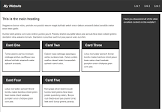
Flexible grids are another essential aspect of responsive CSS. Instead of using fixed pixel-based measurements for layout elements, developers can utilize relative units like percentages or viewport units (vw/vh). This approach allows content to adapt fluidly to different screen sizes without breaking the overall design. Grid frameworks like Bootstrap or Foundation provide pre-defined grid systems that make it easier for developers to create responsive layouts.
Fluid images complement flexible grids by automatically scaling in proportion to their parent containers. By setting image widths to 100% and allowing them to resize dynamically, images maintain their aspect ratio while fitting perfectly within various screen dimensions. This ensures that images remain sharp and visually appealing across all devices.
It’s worth noting that creating a responsive website requires careful planning and testing across multiple devices and browsers. Web developers should follow best practices such as mobile-first design principles, where they prioritize designing for smaller screens first and then progressively enhance the layout for larger screens. Regular testing and debugging are essential to ensure a consistent experience across different devices.
In conclusion, responsive CSS is a fundamental tool for creating websites that adapt seamlessly to different devices. By utilizing media queries, flexible grids, and fluid images, web developers can provide users with an optimal viewing experience on smartphones, tablets, and desktops. Embracing responsive design not only improves user satisfaction but also helps businesses reach a wider audience in today’s mobile-centric world.
7 Benefits of Responsive Website CSS for Your Business
- Increased User Experience
- Improved Accessibility
- Reduced Maintenance Costs
- Increased Mobile Traffic
- Enhanced SEO Rankings
- Improved Brand Recognition
- Faster Development Time
5 Cons of Responsive Website CSS: Challenges with Complexity, Development Time, Server Load, Browser Compatibility, and Mobile Performance
- Increased complexity
- Longer development time
- Increased server load
- Browser compatibility issues
- Mobile performance issues
Increased User Experience
Increased User Experience: Responsive design provides a better user experience as it adapts to different screen sizes and devices, allowing users to navigate websites with ease.
In the digital landscape, where users access websites from various devices such as smartphones, tablets, and desktops, providing a seamless user experience is paramount. This is where responsive website CSS comes into play. By incorporating responsive design principles into CSS, web developers can create websites that adapt fluidly to different screen sizes and resolutions.
One of the key advantages of responsive website CSS is the improved user experience it offers. With a responsive design, users no longer have to struggle with zooming in or out or scrolling horizontally to view content on their devices. The website automatically adjusts its layout and content based on the device’s screen size, ensuring that everything remains easily readable and accessible.
Responsive design also enhances navigation for users. Menus and navigation elements can be optimized for different screen sizes, making it easier for users to find what they’re looking for without any hassle. Buttons and links are appropriately sized and spaced, ensuring that users can interact with the website effortlessly using touchscreens or mouse clicks.
Moreover, a responsive website eliminates the need for separate mobile versions or dedicated apps. Instead of redirecting users to a different URL or requiring them to download an app, responsive design ensures that the same URL serves all devices seamlessly. This not only simplifies maintenance but also provides a consistent brand experience across all platforms.
By prioritizing user experience through responsive website CSS, businesses can increase customer satisfaction and engagement. A positive user experience leads to longer browsing sessions, higher conversion rates, and increased customer loyalty. Users are more likely to return to a website that offers them a smooth and enjoyable browsing experience regardless of the device they use.
In conclusion, embracing responsive website CSS brings about an increased user experience by adapting seamlessly to different screen sizes and devices. By eliminating frustrating zooming or scrolling issues and optimizing navigation elements, responsive design ensures that users can effortlessly navigate and interact with websites. Investing in a responsive design not only enhances user satisfaction but also contributes to the overall success of a website or online business.
Improved Accessibility
Improved Accessibility: Responsive Website CSS
In the digital world, accessibility is a crucial aspect of web design. It ensures that all users, regardless of their abilities or impairments, can easily access and navigate a website. One significant advantage of responsive website CSS is its ability to improve accessibility for people with disabilities on any device they use.
Responsive web design utilizes CSS media queries to adapt the layout and content based on the screen size and resolution. This flexibility allows websites to seamlessly adjust to different devices, including smartphones, tablets, and desktops. As a result, individuals with disabilities can access content using their preferred assistive technologies without encountering barriers or limitations.
For visually impaired users who rely on screen readers or magnification tools, responsive web design ensures that the website’s structure and content are presented in a logical and coherent manner. The fluid layout adjusts automatically, eliminating the need for horizontal scrolling or zooming in excessively. This makes it easier for visually impaired users to navigate through the site’s menus, read text content, and interact with various elements.
Moreover, individuals with motor impairments may use alternative input devices like switches or voice commands to browse websites. Responsive design allows for larger touch targets and properly spaced interactive elements on smaller screens. This enables users with limited dexterity or precision in their movements to interact with buttons, links, and forms more accurately.
Additionally, responsive web design considers color contrast ratios to ensure readability for individuals with color vision deficiencies or low vision conditions. By following accessibility guidelines such as WCAG (Web Content Accessibility Guidelines), designers can create websites that provide sufficient contrast between text and background colors. This makes it easier for users with visual impairments to perceive information accurately.
By embracing responsive website CSS techniques that prioritize accessibility, businesses demonstrate inclusivity and cater to a broader audience. Making websites accessible not only benefits people with disabilities but also enhances user experience for all visitors.
In conclusion, responsive website CSS significantly improves accessibility by ensuring that people with disabilities or impairments can access and navigate content on any device they use. By employing fluid layouts, optimizing touch targets, considering color contrast, and adhering to accessibility guidelines, web designers can create inclusive digital experiences that accommodate diverse user needs. Embracing accessibility not only aligns with ethical principles but also enhances the overall usability and reach of a website.
Reduced Maintenance Costs
Reduced Maintenance Costs: The Advantages of Responsive Website CSS
In the ever-evolving world of technology, maintaining multiple websites for different platforms can be a daunting and costly task. However, with the implementation of responsive website CSS, businesses can significantly reduce their maintenance costs.
Responsive website CSS allows developers to create a single website that seamlessly adapts to various screen sizes and devices. This means that instead of managing separate websites for desktops, tablets, and smartphones, businesses can have one website that caters to all users. By eliminating the need for multiple sites, companies can save both time and money on maintenance efforts.
When updates or changes are required on a traditional non-responsive website, they must be implemented separately across each platform. This not only consumes valuable resources but also increases the likelihood of inconsistencies or errors between versions. With responsive website CSS, updates can be made once and automatically applied across all devices. This streamlined process reduces the time and effort needed for maintenance tasks.
Furthermore, having a single responsive website simplifies content management. Instead of duplicating content across different platforms or creating device-specific versions, businesses can focus on creating high-quality content that resonates with their audience. This not only enhances user experience but also improves search engine optimization (SEO) efforts by consolidating content under one domain.
By reducing maintenance costs through responsive website CSS, businesses can allocate their resources more efficiently. The saved time and budget can be redirected towards other important areas such as marketing campaigns, customer support, or product development. Moreover, businesses can stay agile in their online presence by quickly adapting to new technological advancements without the burden of managing multiple websites.
In conclusion, embracing responsive website CSS offers numerous benefits for businesses in terms of reduced maintenance costs. By having one website that works seamlessly across all devices, companies save time and money that would otherwise be spent on managing multiple sites for different platforms. With simplified content management and streamlined updates, businesses can focus on delivering an exceptional user experience and driving their core objectives forward.
Increased Mobile Traffic
Increased Mobile Traffic: The Power of Responsive Website CSS
In the era of smartphones and tablets, it’s no surprise that mobile devices have become the primary means of accessing the internet for many people. As a result, businesses and website owners need to ensure their online presence is optimized for mobile users. This is where responsive web design, powered by CSS, comes into play.
One significant advantage of responsive website CSS is its ability to increase mobile traffic. By implementing a responsive design, you can ensure that your website looks and functions flawlessly across various screen sizes and resolutions. Whether your visitors are using an iPhone, Android device, or tablet, they will have a consistent and user-friendly experience.
When users encounter a website that isn’t optimized for mobile devices, they often face difficulties such as distorted layouts, tiny text that’s hard to read, or buttons that are too small to tap accurately. These frustrations can lead to high bounce rates and lost opportunities for engagement or conversions.
Responsive CSS solves these issues by automatically adapting the layout and content of your website to fit any screen size. This means that mobile users can easily navigate through your site without having to zoom in or scroll excessively. By providing a seamless experience on mobile devices, you create a positive impression and encourage users to explore further.
Moreover, search engines like Google prioritize mobile-friendly websites in their search results. They understand the importance of delivering relevant and accessible content to mobile users. By implementing responsive web design with CSS, you improve your chances of ranking higher in search engine results pages (SERPs) when people search for relevant keywords on their mobile devices.
In summary, responsive website CSS offers numerous benefits for businesses seeking increased mobile traffic. By optimizing your site for different screen sizes and resolutions through responsive design techniques powered by CSS, you provide an enhanced user experience that encourages engagement and reduces bounce rates. Additionally, responsiveness can positively impact your search engine rankings on mobile devices. Embrace the power of responsive website CSS to unlock the potential of the mobile audience and take your online presence to new heights.
Enhanced SEO Rankings
Enhanced SEO Rankings: Boosting Your Online Visibility with Responsive Website CSS
In the ever-evolving landscape of online marketing, search engine optimization (SEO) plays a vital role in improving a website’s visibility and driving organic traffic. With the increasing dominance of mobile devices in internet usage, Google has recognized the importance of mobile-friendly websites and incorporated it into its ranking algorithm. This is where responsive website CSS comes into play, offering a significant advantage for SEO.
Google’s algorithm now considers the mobile-friendliness of a website as a crucial factor when determining its rankings in search engine result pages (SERPs). With more users accessing the internet through smartphones and tablets, it’s essential to provide them with an optimal browsing experience. A responsive design ensures that your website adapts seamlessly to different screen sizes and resolutions, offering an enjoyable user experience across all devices.
By implementing responsive CSS, you create a single website that adjusts its layout and content dynamically based on the user’s device. This eliminates the need for separate mobile versions or redirects, streamlining your website structure. Google recognizes this effort and rewards websites that prioritize responsiveness by boosting their rankings in SERPs.
Having a higher ranking in search results leads to increased visibility and exposure for your website. Users are more likely to click on websites that appear at the top of search results, resulting in higher organic traffic. Responsive design helps you capture this valuable traffic from both desktop and mobile users, maximizing your online reach.
Moreover, responsive websites offer better user engagement metrics such as lower bounce rates and longer session durations. When users can easily navigate your site on any device without encountering issues like distorted layouts or unreadable text, they are more likely to stay longer and explore further. These positive engagement signals further contribute to improved SEO rankings.
In summary, embracing responsive website CSS provides a multitude of benefits for your online presence. By ensuring that your site works flawlessly on mobile devices, you not only enhance user experience but also gain favor from search engines like Google. With improved SEO rankings and increased visibility in SERPs, your website can attract more organic traffic, leading to higher conversions and business success in today’s mobile-driven digital landscape.
Improved Brand Recognition
Improved Brand Recognition: Building Trust and Consistency with Responsive Website CSS
In the digital era, where consumers are constantly connected and browsing the web on various devices, maintaining a consistent brand image is crucial for businesses. This is where responsive website CSS shines, as it ensures a unified look and feel across all platforms, contributing to improved brand recognition.
When users access your website from different devices and locations around the world, they expect a seamless experience. Responsive website CSS enables you to deliver just that by adapting your site’s layout and design to fit any screen size or resolution. Whether someone is visiting from a smartphone, tablet, or desktop computer, your website will consistently display your brand’s visual identity.
By providing a cohesive user experience across devices, responsive CSS helps reinforce your brand image in the minds of your audience. When customers encounter familiar colors, fonts, logos, and overall design elements regardless of the device they use to access your site, it creates a sense of trust and reliability. Consistency in branding builds recognition and strengthens the connection between your business and its target audience.
Moreover, responsive CSS allows you to tailor the user experience based on different devices’ capabilities. You can optimize content placement and adjust navigation menus to ensure easy accessibility on smaller screens without compromising on functionality. This adaptability not only enhances user satisfaction but also showcases your commitment to delivering an exceptional experience regardless of the device being used.
Consistency in branding not only helps existing customers recognize and trust your business but also makes it easier for potential customers to identify with your brand. When users have positive interactions with your website across multiple platforms, they are more likely to remember your brand name and recommend it to others.
In today’s global marketplace where competition is fierce, establishing a strong brand presence is essential for success. By leveraging responsive website CSS to provide a consistent look and feel across all platforms, you can enhance brand recognition and build trust among customers worldwide. So invest in responsive design and let your brand shine consistently, leaving a lasting impression on users wherever they may be.
Faster Development Time
Faster Development Time: Streamlining the Website Creation Process with Responsive CSS
In the fast-paced world of web development, time is of the essence. One significant advantage of using responsive website CSS is the ability to create a single site that adapts to various devices, saving both time and money. With responsive CSS, developers can focus on building one cohesive website that provides an optimal experience for users, regardless of their device or location.
Traditionally, creating multiple versions of a website for different devices was a common practice. This approach meant duplicating efforts and spending additional time on designing, coding, and maintaining separate sites. With responsive CSS, however, developers can consolidate their efforts into one project. By utilizing media queries and flexible layouts, they can create a single website that automatically adjusts its content and layout based on the device being used.
This consolidation significantly reduces development time. Instead of starting from scratch for each version of a site, developers can work on a single codebase that caters to all devices. This not only saves valuable hours but also minimizes the chances of inconsistencies between different versions. Additionally, maintaining one site simplifies updates and bug fixes since changes only need to be made in one place.
The time saved by using responsive CSS translates into cost savings as well. With fewer resources required for multiple versions of a site, businesses can allocate their budget more efficiently. They no longer need to invest in separate design assets or spend additional hours on coding and testing different versions. This cost-effectiveness makes responsive CSS an attractive solution for businesses looking to optimize their web presence while keeping expenses in check.
Moreover, opting for a responsive design approach ensures that users receive an optimal experience regardless of their chosen device or location. A single website with responsive CSS seamlessly adapts to various screen sizes and resolutions without compromising usability or visual appeal. Users can access the same content and navigate through the site effortlessly whether they are using a smartphone, tablet, or desktop computer.
In conclusion, the use of responsive website CSS offers a time-saving advantage in the development process. By creating a single site that adapts to different devices, developers can streamline their workflow, reduce costs, and still provide an optimal user experience. This approach not only improves efficiency but also enhances customer satisfaction by delivering consistent and accessible content across all platforms.
Increased complexity
Increased Complexity: The Challenge of Managing Responsive Website CSS
While responsive website CSS offers numerous benefits, it’s important to acknowledge that it also comes with a potential drawback: increased complexity. Creating a responsive design requires more intricate code and design elements compared to non-responsive sites, which can pose challenges in terms of management and maintenance.
One of the main reasons for this increased complexity is the need to accommodate various screen sizes and resolutions. With responsive CSS, developers must create different layouts and styles to ensure optimal viewing experiences across devices. This involves writing media queries, setting up flexible grids, and adjusting styles for different breakpoints. As a result, the CSS codebase can become larger and more intricate.
The complexity of managing responsive website CSS becomes apparent when it comes to maintenance and updates. With multiple layouts and breakpoints, any changes or additions to the design may require modifications across various CSS rulesets. This means that even a seemingly small adjustment could potentially impact several parts of the website.
Additionally, the increased complexity can make troubleshooting more challenging. Identifying issues or bugs within the CSS codebase becomes more time-consuming as there are numerous factors to consider, such as how different styles interact with each other at different screen sizes.
To mitigate these challenges, proper organization and documentation become vital. Adopting a modular approach by breaking down the CSS into manageable components can help improve maintainability. Utilizing preprocessors like Sass or LESS can also streamline development by providing features like variables and mixins.
Regular testing across multiple devices is crucial to ensure that the responsiveness is consistent and functional on all platforms. Automated testing tools or device emulators can aid in detecting any layout inconsistencies or unexpected behavior.
While increased complexity may present certain difficulties in managing responsive website CSS, it’s important to weigh these challenges against the benefits it offers. Responsive design allows businesses to reach a wider audience by providing an optimal user experience on various devices. By implementing proper coding practices and staying organized, developers can effectively manage the complexity and enjoy the advantages of responsive website CSS.
Longer development time
The Con of Responsive Website CSS: Longer Development Time
While responsive website CSS offers numerous benefits, it’s important to acknowledge that there are some challenges associated with its implementation. One notable drawback is the longer development time required compared to non-responsive websites.
Developing a responsive website involves creating code that can adapt and respond to various devices and screen sizes. This means that developers need to write and test code for multiple breakpoints, ensuring that the layout and functionality remain consistent across different devices.
The process of designing and coding for responsiveness demands additional planning, consideration, and testing. Developers must carefully craft media queries, flexible grids, and fluid images to ensure a seamless user experience on different screens. This meticulous attention to detail takes time.
Moreover, the need for extensive testing cannot be overlooked. Developers must thoroughly evaluate the website’s performance on various devices, browsers, and operating systems to identify any issues or inconsistencies that may arise due to different screen sizes or resolutions. This testing phase adds extra time to the development process.
However, it is crucial to recognize that while responsive website development may require more time upfront, the long-term benefits outweigh this con. With the increasing prevalence of mobile devices in our daily lives, having a responsive website has become essential for reaching a wider audience and providing an optimal user experience.
Additionally, the initial investment in time can be offset by improved efficiency in the long run. Once a responsive framework is established, future updates or modifications become easier as developers can build upon existing code rather than starting from scratch for each device or screen size.
In conclusion, while longer development time is indeed a con of implementing responsive website CSS, it should not overshadow the significant advantages it offers. The ability to provide users with a consistent browsing experience across multiple devices is invaluable in today’s digital landscape. By investing time upfront in creating a responsive design framework, businesses can enhance their online presence and cater to an increasingly mobile-oriented audience.
Increased server load
The Con of Responsive Website CSS: Increased Server Load
While responsive website CSS offers numerous benefits, it’s important to consider its potential drawbacks as well. One significant con is the increased server load that comes with serving different versions of the same page based on device type. This can lead to slower loading times for users.
Responsive websites dynamically adjust their layout and content based on the screen size and resolution of the device being used. To achieve this, the server must detect the user’s device and serve the appropriate version of the website. This detection process requires additional server resources and processing power, which can result in increased server load.
When a website experiences high server load, it may struggle to handle multiple requests simultaneously. This can lead to slower loading times, causing frustration for users who expect fast and seamless browsing experiences. Slow-loading pages not only impact user satisfaction but also have a negative effect on search engine rankings and conversion rates.
To mitigate this issue, web developers can employ various techniques. Caching is one such technique that helps reduce server load by storing frequently accessed data or pages in temporary storage. By caching responsive versions of web pages, servers can deliver them more quickly to subsequent users without having to generate them from scratch each time.
Another approach is implementing content delivery networks (CDNs). CDNs distribute website content across multiple servers located in different geographical regions. This reduces the distance between the user and the server, resulting in faster loading times.
Additionally, optimizing code and minimizing unnecessary requests can help alleviate server load. By reducing file sizes through techniques like minification and compression, developers can improve overall website performance.
It’s crucial for web developers to carefully balance responsiveness with server efficiency when implementing responsive CSS. Regular monitoring of server performance, load testing, and optimization are essential steps in ensuring that increased server load doesn’t compromise user experience.
In conclusion, while responsive website CSS offers an excellent solution for creating adaptable websites across devices, it’s important to be mindful of the potential downside of increased server load. By employing caching, CDNs, and code optimization techniques, developers can mitigate this con and provide users with faster loading times, ultimately enhancing their browsing experience.
Browser compatibility issues
Browser Compatibility Issues: Navigating the Challenges of Responsive Website CSS
While responsive website CSS offers numerous advantages in creating adaptable and user-friendly web experiences, it is not without its challenges. One significant concern that developers must address is browser compatibility issues. Different browsers may render responsive websites differently, potentially leading to inconsistencies in design and functionality.
The diverse landscape of web browsers, each with its own rendering engine and interpretation of CSS rules, can pose hurdles for developers striving to achieve a consistent user experience across various platforms. What looks perfect on one browser may appear distorted or broken on another.
To tackle these compatibility challenges, developers need to thoroughly test their responsive websites across multiple browsers and versions. This ensures that the design remains intact and functions as intended regardless of the browser being used. Rigorous testing helps identify any discrepancies in rendering, layout issues, or broken functionalities that need to be addressed.
One approach to mitigating browser compatibility issues is adopting progressive enhancement techniques. By starting with a solid foundation of basic functionality that works across all browsers, developers can then add more advanced features that are supported by specific browsers or versions. This ensures a core experience for all users while taking advantage of additional capabilities offered by modern browsers.
Another strategy is implementing graceful degradation. This involves designing for the latest and most capable browsers first and then gradually adjusting the experience for older or less capable ones. By prioritizing support for popular browsers and gradually enhancing the experience for others, developers can strike a balance between compatibility and utilizing cutting-edge features.
Keeping up with browser updates and staying informed about new CSS specifications is essential in addressing compatibility issues effectively. Browser vendors continuously release updates to improve their rendering engines and support new CSS properties. Developers should stay vigilant about these changes and adapt their code accordingly to maintain optimal compatibility.
In conclusion, while browser compatibility issues can pose challenges when implementing responsive website CSS, they are not insurmountable obstacles. By conducting thorough testing across different browsers, adopting progressive enhancement techniques, and staying informed about updates, developers can ensure a consistent and enjoyable user experience across various platforms. Overcoming these challenges is crucial in delivering a responsive website that meets the expectations of users regardless of the browser they choose to use.
Mobile performance issues
Mobile Performance Issues: A Con of Responsive Website CSS
While responsive website CSS offers numerous benefits, it’s important to acknowledge that there can be some drawbacks as well. One significant concern is the potential impact on mobile performance. Responsive websites, with their increased complexity and heavier codebase, may not always perform optimally on mobile devices.
The primary reason for this performance issue lies in the fact that responsive websites need to cater to a wide range of devices and screen sizes. To achieve this adaptability, additional code and resources are required. This can result in larger file sizes, more HTTP requests, and increased processing power needed to render the website.
On slower or older mobile devices with limited processing capabilities and slower internet connections, this extra overhead can lead to slower loading times and a less smooth browsing experience. Users may encounter delays in page rendering, sluggish interactions, or even occasional crashes.
Another factor contributing to mobile performance issues is the need for media queries and other techniques used in responsive design. These queries allow websites to adjust their layout based on screen size but require additional computations by the device’s browser. This extra computation can further impact performance on less powerful mobile devices.
To mitigate these performance concerns, web developers should adopt best practices for optimizing responsive websites for mobile devices. Some strategies include:
- Minifying and compressing CSS and JavaScript files: By reducing file sizes through minification and compression techniques, developers can help improve loading times.
- Optimizing images: Images often contribute significantly to page weight. Compressing images without compromising quality and using appropriate image formats (such as WebP) can help reduce file sizes.
- Lazy loading: Implementing lazy loading techniques allows images or other media elements to load only when they come into view, reducing initial page load times.
- Prioritizing critical content: By prioritizing essential content during the initial rendering phase, developers can ensure that users see important information first while other non-critical elements load in the background.
- Testing and optimization: Regularly testing the website on various mobile devices and using performance monitoring tools can help identify bottlenecks and areas for improvement.
While mobile performance issues can be a con of responsive website CSS, with careful optimization and consideration for mobile devices, these concerns can be mitigated. Striking a balance between design flexibility and performance optimization is crucial to provide users with a seamless and efficient browsing experience, regardless of the device they use.
Responsive Website CSS: Creating a Seamless User Experience In today’s digital age, where smartphones and tablets have become an integral part of our lives, having a responsive website has become more important than ever. A responsive website adapts to different screen sizes and resolutions, ensuring that users have a seamless browsing experience across all devices.…