
Unlocking the Power of Responsive Web Design: Why Your Website Needs to be Mobile-Friendly
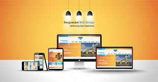
In today’s world, having a website that is accessible on all devices is more important than ever. With the rise of smartphones and tablets, people are accessing the internet from an array of different devices. This is where responsive web design comes into play.
Responsive web design is an approach to web design that allows websites to adapt to the size of the screen they are being viewed on. This means that a website will look great on a desktop computer, but it will also look just as good on a smartphone or tablet.
The benefits of responsive web design are numerous. Firstly, it provides a better user experience for visitors to your website. A website that is optimized for mobile devices will load faster and be easier to navigate, which means visitors are more likely to stay on your site and engage with your content.
Secondly, responsive web design can help with search engine optimization (SEO). Google has made it clear that mobile-friendly websites will rank higher in search results than those that aren’t optimized for mobile devices. This means that if your website isn’t responsive, you could be missing out on potential traffic and customers.
Finally, responsive web design can save you time and money in the long run. Rather than having separate websites for desktop and mobile users, you only need one website that adapts to all devices. This means you only need to maintain one website rather than two or more.
In conclusion, responsive web design is essential in today’s digital landscape. It provides a better user experience, improves SEO rankings and saves time and money in the long run. If you haven’t already implemented responsive web design into your website, now is the time to do so!
Frequently Asked Questions About Responsive Web Design: Understanding the Components, Examples, and Benefits
- What are the 3 components of responsive web design?
- What is a responsive website design?
- What are examples of responsive design?
- What is a responsive website example?
What are the 3 components of responsive web design?
The three components of responsive web design are:
Flexible layouts: This component involves using flexible grids and layouts that can adjust to different screen sizes. This means that the website’s content will automatically adjust and resize based on the size of the screen it is being viewed on.
Media queries: Media queries allow designers to specify different styles for different devices and screen sizes. This means that a website can have different styles for desktop, tablet, and mobile devices, ensuring an optimal viewing experience for each device.
3. Responsive images: Responsive images ensure that images on a website are optimized for each device’s screen size. This involves using HTML and CSS to specify different image sizes, so the appropriate image is loaded based on the device’s screen size. This helps improve page load times and overall user experience.
What is a responsive website design?
A responsive website design is an approach to web design that ensures a website can adapt to the size of the screen it is being viewed on. This means that a website will look great and function well on any device, whether it’s a desktop computer, laptop, tablet or smartphone.
Responsive web design uses techniques such as fluid grids, flexible images and media queries to adjust the layout and content of a website based on the size of the screen. This allows for a better user experience as visitors can easily navigate and interact with the website on any device without having to zoom in or scroll sideways.
The goal of responsive web design is to ensure that a website looks good and functions well regardless of the device it is being viewed on. This not only improves user experience but also helps with search engine optimization (SEO) as Google prioritizes mobile-friendly websites in search results.
In today’s digital age where people are accessing websites from an array of different devices, having a responsive website design is essential for any business or organization looking to establish an effective online presence.
What are examples of responsive design?
There are many examples of responsive design on the internet. Here are a few examples:
Starbucks: The Starbucks website is a great example of responsive design. The website adapts to the size of the screen it is being viewed on, whether it’s a desktop computer, tablet or smartphone.
Amazon: Amazon’s website is another great example of responsive design. The website adjusts to fit any screen size, making it easy to navigate and shop on any device.
Apple: Apple’s website is designed with responsiveness in mind. The site adapts to any screen size and provides an optimal user experience for visitors.
The New York Times: The New York Times has a responsive website that adjusts to all devices, making it easy for readers to access news and information no matter where they are.
Airbnb: Airbnb’s website is designed with responsiveness in mind, allowing users to search for accommodations and book trips from any device.
These are just a few examples of websites that have implemented responsive design successfully. By adapting to all devices, these websites provide an optimal user experience for visitors and help businesses reach a wider audience.
What is a responsive website example?
There are many examples of responsive websites, but one of the most well-known is the website for Starbucks. The Starbucks website is designed to be responsive so that it looks great on all devices, whether you’re viewing it on a desktop computer, a tablet or a smartphone.
When you visit the Starbucks website, you’ll notice that the layout and design changes depending on the size of your screen. On a desktop computer, you’ll see a large banner image with navigation links at the top of the page. On a mobile device, however, the banner image is smaller and the navigation links are hidden behind a menu icon to save space.
The content on the Starbucks website is also optimized for different devices. For example, if you’re viewing the site on a mobile device, you’ll see larger text and bigger buttons to make it easier to navigate with your fingers.
Overall, the Starbucks website is an excellent example of responsive web design in action. It provides an excellent user experience no matter what device you’re using to access it and shows how responsive design can help businesses reach their customers more effectively.
In today’s world, having a website that is accessible on all devices is more important than ever. With the rise of smartphones and tablets, people are accessing the internet from an array of different devices. This is where responsive web design comes into play. Responsive web design is an approach to web design that allows…