
The Art of Print and Media Design: Blending Creativity and Communication
Print and Media Design: Bridging the Gap Between Creativity and Communication
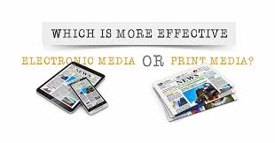
In today’s digital age, where screens dominate our lives, it’s easy to overlook the power and impact of print and media design. However, print design remains a vital medium that continues to captivate audiences and convey messages in a tangible and memorable way. From magazines and newspapers to brochures, posters, and packaging, print design has an enduring presence that cannot be replicated by digital platforms alone.
Print design is an art form that seamlessly blends creativity with communication. It encompasses not only visually appealing layouts but also strategic thinking to effectively convey information. A well-designed print piece grabs attention, engages the viewer, and communicates a message with clarity and elegance.
One of the key strengths of print design lies in its tangibility. Holding a beautifully crafted magazine or flipping through the pages of a thoughtfully designed brochure creates a sensory experience that cannot be replicated on a screen. The texture of paper, the weight of the publication, and even the smell of ink all contribute to an immersive experience that leaves a lasting impression on the reader.
Print design also offers unparalleled versatility when it comes to customization. Designers have complete control over every aspect of their creation – from selecting paper types and finishes to choosing typography, colors, and imagery. This level of control allows for endless possibilities in creating unique designs tailored specifically for the intended audience.
Furthermore, print design has proven to be highly effective in capturing attention amidst today’s digital noise. With online advertisements bombarding users at every turn, printed materials offer a refreshing break from screen-based distractions. A well-placed poster or eye-catching brochure can stand out in physical spaces where people can engage with them at their own pace without being interrupted by pop-ups or notifications.
While digital media certainly has its advantages in terms of reach and interactivity, print design offers an opportunity for brands to differentiate themselves by creating tangible connections with their audience. By carefully integrating print and media design into a comprehensive marketing strategy, businesses can maximize the impact of their messaging across multiple channels.
In conclusion, print and media design continue to play a significant role in our visually saturated world. The combination of creativity, strategic thinking, and tangibility makes print design a powerful tool for effective communication. By embracing the unique qualities of print design alongside digital platforms, businesses can create compelling experiences that resonate with their audience and leave a lasting impression. So, let’s not overlook the power of print – it’s time to embrace its enduring charm and leverage its potential to captivate hearts and minds.
5 Essential Tips for Effective Print and Media Design
- Keep it simple. Too much clutter will make your design look busy and unappealing.
- Use high-quality images and graphics to draw attention to your design.
- Make sure the text is legible and easy to read by using a font size that is appropriate for the medium you are designing for (e.g., print or web).
- Incorporate elements of white space into your design, as it will help keep the focus on the main message you are trying to convey with your design.
- Test out different color combinations before settling on one, as colors can evoke certain emotions from viewers and should be used intentionally in order to enhance the desired effect of your design work.
Keep it simple. Too much clutter will make your design look busy and unappealing.
Keep it Simple: The Art of Minimalism in Print and Media Design
In the world of print and media design, simplicity is often the key to creating visually appealing and effective designs. When it comes to design, less is often more. By keeping your design clean, uncluttered, and focused on the essentials, you can create a powerful visual impact that captures attention and delivers your message with clarity.
One common mistake designers make is trying to include too much information or visual elements in their designs. This can result in a cluttered and overwhelming composition that confuses the viewer and dilutes the intended message. By embracing simplicity, you allow your design to breathe and create a sense of balance that draws the viewer’s eye to the most important elements.
A simple design doesn’t mean it has to be boring or lacking creativity. On the contrary, minimalism can be incredibly impactful when executed with intentionality. By carefully selecting and arranging elements, you can create a harmonious composition that speaks volumes with minimal visual noise.
When adopting a minimalist approach, focus on using ample white space or negative space. This empty space surrounding your design elements provides breathing room for each element to shine individually while also creating an overall sense of elegance and sophistication.
Typography plays a crucial role in maintaining simplicity in your design. Opt for clean and legible fonts that enhance readability while conveying the desired tone or mood. Avoid using too many different fonts as it can lead to visual confusion. Stick to a limited number of typefaces that complement each other well.
Color choice also plays a significant role in keeping your design simple yet visually striking. Selecting a limited color palette helps maintain coherence throughout your design while avoiding overwhelming the viewer. A well-chosen color scheme can evoke emotions, highlight important information, or guide the viewer’s attention without adding unnecessary complexity.
Remember, simplicity doesn’t mean sacrificing creativity or impact; rather, it allows you to distill your message to its essence and present it in a visually pleasing manner. By eliminating unnecessary clutter, you create a design that is visually appealing, easy to understand, and memorable.
In a world filled with information overload, simplicity stands out. So, embrace the art of minimalism in your print and media design. Keep it simple, declutter your designs, and let the power of simplicity speak volumes.
Use high-quality images and graphics to draw attention to your design.
In the realm of print and media design, the saying “a picture is worth a thousand words” holds true. Utilizing high-quality images and graphics is a surefire way to captivate your audience and draw attention to your design.
When it comes to visual communication, the quality of your images and graphics can make or break the overall impact of your design. Low-resolution or pixelated visuals can undermine the professionalism and credibility of your work. On the other hand, high-quality visuals have the power to elevate your design, leaving a lasting impression on viewers.
Using high-resolution images ensures that every detail is clear and crisp, enhancing the overall aesthetic appeal of your design. Whether you’re designing a magazine spread, a brochure, or a poster, sharp and vibrant visuals will grab attention and engage viewers from the moment they lay eyes on your creation.
Additionally, high-quality graphics contribute to the overall cohesiveness of your design. They add depth, texture, and visual interest that can enhance the message you’re trying to convey. Whether it’s through illustrations, icons, or infographics, well-crafted graphics can communicate complex ideas in an easily digestible manner.
To ensure you’re using top-notch visuals in your print and media designs, consider investing in professional photography or utilizing reputable stock image websites that offer high-resolution options. If you’re creating custom graphics or illustrations, employing skilled designers who understand the principles of composition and visual hierarchy will elevate your work even further.
Remember that using high-quality images and graphics isn’t just about aesthetics; it’s about creating an immersive experience for your audience. By paying attention to detail and prioritizing visual excellence in your designs, you’ll not only capture attention but also establish credibility and make a memorable impact on those who engage with your work.
In conclusion, when it comes to print and media design, don’t underestimate the power of high-quality images and graphics. They are essential tools for drawing attention, enhancing the visual appeal of your designs, and effectively communicating your message. So, prioritize the use of top-notch visuals and elevate your designs to new heights.
Make sure the text is legible and easy to read by using a font size that is appropriate for the medium you are designing for (e.g., print or web).
The Importance of Legible Text in Print and Media Design
When it comes to print and media design, one crucial aspect that should never be overlooked is the legibility of the text. No matter how visually stunning a design may be, if the text is difficult to read, the message will be lost. That’s why choosing an appropriate font size for the medium you are designing for is essential.
In print design, whether it’s a magazine, brochure, or poster, readability is paramount. The goal is to ensure that readers can effortlessly consume the information presented to them. Selecting a font size that is too small can strain the eyes and discourage engagement with the content. On the other hand, using an excessively large font size may disrupt the overall visual balance of the design.
Similarly, when designing for web or digital media, legibility remains a critical factor. With various screen sizes and resolutions in use today, it’s crucial to consider responsive design principles and choose a font size that adapts well across different devices. This ensures that users can comfortably read the text without having to zoom in or strain their eyes.
Finding the right font size involves striking a balance between aesthetics and functionality. It’s essential to consider factors such as viewing distance (for print), screen resolution (for digital), and target audience demographics. For instance, if your target audience consists mostly of older individuals with potential vision impairments, opting for a larger font size might be beneficial.
Additionally, typography plays a significant role in enhancing readability. Choosing fonts with clear letterforms and appropriate spacing between characters (kerning) improves legibility. Avoid overly decorative or intricate fonts that sacrifice readability for style.
Remember that legible text doesn’t just benefit readers; it also reflects positively on your brand’s professionalism and attention to detail. A well-designed layout with easily readable text creates a positive user experience and encourages people to engage further with your content.
In conclusion, ensuring that the text in your print and media designs is legible and easy to read is crucial for effective communication. By selecting an appropriate font size for the medium you are designing for, you enhance readability and maximize the impact of your message. So, pay attention to typography, consider your audience, and strike the right balance between aesthetics and functionality. Your design will not only look visually appealing but also effectively convey its intended message to your audience.
Incorporate elements of white space into your design, as it will help keep the focus on the main message you are trying to convey with your design.
Incorporating White Space: The Key to Design Focus
When it comes to print and media design, one of the most effective tips is to embrace the power of white space. White space, also known as negative space, refers to the empty areas intentionally left blank in a design. While it may seem counterintuitive to leave parts of a layout empty, incorporating white space is a strategic choice that can greatly enhance the impact and clarity of your message.
White space serves as a visual breathing room, allowing elements within your design to stand out and capture attention. By giving your content some room to breathe, you create a sense of balance and harmony that guides the viewer’s eye towards what truly matters – the main message you want to convey.
The absence of clutter in white space helps prevent visual overload and allows your design to communicate its intended message with greater clarity. It provides a sense of organization and structure, making it easier for viewers to navigate through the information presented. By strategically placing white space around important elements or blocks of text, you can highlight their significance and make them more memorable.
Moreover, white space enhances readability. It makes text more legible by providing separation between lines and paragraphs. When text is surrounded by ample white space, it becomes easier on the eyes and encourages readers to engage with the content rather than feeling overwhelmed by dense blocks of information.
Incorporating white space requires careful consideration during the design process. It involves finding a balance between elements that are present and those that are absent. Experimenting with different layouts and spacing can help achieve an optimal composition where white space complements and emphasizes your main message.
Remember that white space doesn’t necessarily have to be pure white – it can be any color or even patterned as long as it creates sufficient contrast with other elements in your design. The goal is not just to fill up every inch but rather to strike a harmonious balance between positive and negative space.
In conclusion, incorporating white space into your print and media design is a powerful technique to maintain focus on your main message. By embracing this tip, you can create designs that are visually appealing, easy to navigate, and effectively communicate your intended message. So, don’t be afraid to let your design breathe – harness the power of white space and watch your message shine.
Test out different color combinations before settling on one, as colors can evoke certain emotions from viewers and should be used intentionally in order to enhance the desired effect of your design work.
In the world of print and media design, colors hold immense power. They have the ability to evoke emotions, communicate messages, and create memorable experiences. Therefore, it is crucial to test out different color combinations before settling on one for your design work.
Colors have a profound impact on how people perceive and interpret visual content. Each color carries its own psychological associations and can elicit specific emotions or reactions from viewers. For example, warm colors like red and orange often evoke feelings of excitement or passion, while cool colors like blue and green tend to create a sense of calm or tranquility.
By intentionally selecting color combinations that align with the desired effect of your design, you can enhance its overall impact. Whether you aim to create a bold and energetic design or a serene and peaceful atmosphere, choosing the right colors is key.
Testing out different color combinations allows you to see how they interact with each other and how they affect the overall mood of your design. It’s important to consider factors such as contrast, harmony, and balance when experimenting with colors. Colors that clash or compete for attention can create visual confusion, while well-balanced combinations can enhance readability and engagement.
Fortunately, there are various tools available that can assist in exploring different color palettes. Online color generators or design software often provide pre-selected harmonious color schemes or allow you to create your own custom combinations. These tools enable you to visualize how different colors work together before implementing them in your final design.
Remember that the impact of colors can also vary across different cultures and contexts. It’s essential to consider the cultural associations attached to certain colors when designing for diverse audiences.
In conclusion, testing out different color combinations in print and media design is an essential step towards creating impactful visuals. By understanding the emotions evoked by various colors and using them intentionally in your designs, you can effectively enhance the desired effect on viewers. So go ahead, experiment with colors, find the perfect combination, and let your design work speak volumes through the power of color.
Print and Media Design: Bridging the Gap Between Creativity and Communication In today’s digital age, where screens dominate our lives, it’s easy to overlook the power and impact of print and media design. However, print design remains a vital medium that continues to captivate audiences and convey messages in a tangible and memorable way. From…