
Maximizing SEO Success with Responsive Web Design
The Importance of Responsive Web Design for SEO
In today’s digital age, having a strong online presence is crucial for the success of any business. With the ever-increasing use of mobile devices, it has become imperative for websites to be optimized for different screen sizes and resolutions. This is where responsive web design comes into play.
Responsive web design refers to the practice of creating websites that adapt and respond seamlessly to various devices, including desktops, laptops, tablets, and smartphones. It ensures that users have a consistent and enjoyable browsing experience regardless of the device they are using.
But how does responsive web design impact search engine optimization (SEO)? Let’s explore its significance in driving organic traffic and improving your website’s visibility on search engine result pages (SERPs).
Improved User Experience:
One of the key factors that search engines consider when ranking websites is user experience. A responsive website provides a better user experience by automatically adjusting its layout and content to fit different screen sizes. This means that visitors can easily navigate your site, read your content, and interact with your features without any hassle. When users have a positive experience on your site, they are more likely to stay longer, explore more pages, and potentially convert into customers. Search engines recognize this engagement and reward responsive websites with higher rankings.
Mobile-Friendly Algorithm:
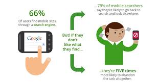
Search engines like Google have implemented mobile-first indexing as part of their algorithm updates. Mobile-first indexing means that Google primarily uses the mobile version of a website for indexing and ranking purposes. If your website is not mobile-friendly or lacks a responsive design, it may suffer in terms of visibility on SERPs. By embracing responsive web design, you ensure that both desktop and mobile users can access your content easily, increasing your chances of ranking well in search results.
Faster Page Loading Speed:
Page loading speed is another critical factor in SEO rankings. Responsive web design helps optimize loading times by eliminating the need for multiple versions of your website. Instead of redirecting users to a separate mobile site, responsive design allows all users to access the same URL. This reduces the loading time and minimizes the risk of high bounce rates. Search engines prioritize websites that load quickly, as it enhances user experience, and responsive design plays a significant role in achieving this.
Reduced Duplicate Content:
Having multiple versions of your website can lead to duplicate content issues, which can negatively impact your SEO efforts. With responsive web design, you eliminate the need for duplicate content by presenting the same HTML code to all users. This helps search engines understand your site’s structure better and prevents any confusion regarding indexing and ranking.
Link Building and Social Sharing:
Responsive web design simplifies link building efforts as it allows for a single URL across all devices. When other websites link to your content, they will be linking to one URL rather than different versions of your site. This consolidation of links boosts your domain authority and strengthens your SEO strategy. Additionally, responsive design facilitates social sharing as users can easily share and access your content on various devices, expanding its reach and potential for engagement.
In conclusion, responsive web design is not only essential for providing an optimal user experience but also plays a crucial role in improving SEO performance. By embracing this approach, you ensure that your website is accessible, user-friendly, and visible across all devices. It’s an investment that pays off in terms of increased organic traffic, higher search engine rankings, and ultimately, business success in the digital landscape.
7 Essential Tips for SEO in Responsive Web Design
- Design for all devices
- Optimize page speed
- Use mobile-friendly content
- Include a mobile sitemap
- Utilize structured data markup
- Keep URL structure consistent across all devices
- Optimize images for different device sizes
Design for all devices
Design for All Devices: Enhancing SEO with Responsive Web Design
In today’s mobile-driven world, having a website that caters to users on all devices is no longer a luxury but a necessity. As the number of smartphone and tablet users continues to rise, businesses must adapt their web design strategies to ensure a seamless user experience across all devices. This is where responsive web design comes into play.
Responsive web design focuses on creating websites that automatically adjust their layout and content to fit any screen size or resolution. By doing so, it guarantees that visitors can access and navigate your site effortlessly, regardless of whether they are using a desktop computer, laptop, tablet, or smartphone.
But how does designing for all devices impact your website’s search engine optimization (SEO) efforts? Let’s delve into this crucial aspect.
Improved User Experience:
One of the primary goals of search engines is to provide users with the best possible experience when they visit a website. A responsive design ensures that your site offers an optimal user experience across all devices. Users won’t have to zoom in or scroll horizontally to read content or interact with features. Instead, they can effortlessly access your site’s full functionality with minimal effort. This positive user experience translates into longer visit durations, lower bounce rates, and increased engagement—all factors that search engines consider when ranking websites.
Consolidated SEO Efforts:
When you have separate desktop and mobile versions of your website, you need to manage two sets of URLs and optimize each separately for SEO. This can be time-consuming and may dilute your SEO efforts. With responsive web design, you consolidate everything into one URL for all devices. This means that any optimizations you make will benefit both desktop and mobile users simultaneously. It simplifies your SEO strategy by focusing on a single version of your site while providing an enhanced user experience across the board.
Mobile-Friendly Ranking Boost:
Search engines have recognized the importance of mobile-friendly websites in today’s digital landscape. Google, for instance, rewards mobile-friendly sites with higher rankings in search results. By designing for all devices and implementing responsive web design, you ensure that your website is mobile-friendly and adheres to the best practices recommended by search engines. This can give you a competitive edge over non-responsive websites when it comes to ranking on mobile search results.
Future-Proofing Your Website:
Designing for all devices is not only beneficial for your current SEO efforts but also future-proofs your website. With new devices constantly entering the market and evolving screen sizes, having a responsive design ensures that your site remains accessible and user-friendly across a wide range of devices. It saves you from the hassle of redesigning or maintaining separate versions of your site as technology advances.
In conclusion, designing for all devices through responsive web design is a crucial step in enhancing your website’s SEO performance. By providing an optimal user experience across desktop and mobile platforms, consolidating your SEO efforts, and staying ahead of emerging trends, you can boost your search engine rankings and drive organic traffic to your site. Embrace the power of responsive web design to cater to users on all devices while reaping the benefits of improved SEO visibility.
Optimize page speed
Optimize Page Speed: A Key Element of Responsive Web Design SEO
When it comes to responsive web design and SEO, one crucial factor that should never be overlooked is page speed optimization. In today’s fast-paced digital world, users expect websites to load quickly and efficiently. If your website takes too long to load, visitors will likely abandon it and move on to a competitor’s site. This not only leads to a poor user experience but also negatively impacts your search engine rankings.
Page speed optimization involves implementing various techniques to reduce the loading time of your web pages. Here are some key reasons why optimizing page speed is essential for responsive web design SEO:
Improved User Experience:
A fast-loading website contributes significantly to a positive user experience. Users don’t want to wait around for a webpage to load; they want instant access to the information they seek. By optimizing your page speed, you ensure that visitors can quickly navigate through your site, find what they need, and have a seamless browsing experience across different devices. This positive experience encourages users to stay longer on your site, engage with your content, and potentially convert into customers.
Higher Search Engine Rankings:
Search engines like Google prioritize user experience when determining search rankings. Page speed is one of the factors they consider in their algorithms. Websites that load faster tend to rank higher in search results because search engines recognize that these sites provide a better user experience. By optimizing your page speed as part of your responsive web design strategy, you increase the chances of ranking well on search engine result pages (SERPs) and attracting organic traffic.
Reduced Bounce Rates:
A slow-loading website often leads to high bounce rates, meaning visitors leave shortly after arriving on a page without exploring further or taking any action. High bounce rates send negative signals to search engines about the quality and relevance of your website’s content. Optimizing page speed helps reduce bounce rates by providing users with a smooth and efficient browsing experience. When users can access your content quickly, they are more likely to stay on your site, explore additional pages, and engage with your offerings.
Mobile Optimization:
In the mobile-first era, having a responsive website that loads quickly on mobile devices is crucial. Mobile users have even less patience for slow-loading websites than desktop users. By optimizing page speed for mobile devices, you ensure that your responsive website is truly mobile-friendly. This not only improves user experience but also aligns with search engines’ mobile-first indexing approach, which can positively impact your search rankings.
Competitive Advantage:
In today’s competitive online landscape, every advantage counts. Optimizing page speed gives you an edge over competitors who may neglect this crucial aspect of responsive web design SEO. A fast-loading website sets you apart from the competition by delivering a superior user experience and attracting more visitors. This can lead to increased engagement, conversions, and ultimately, business growth.
Incorporating page speed optimization into your responsive web design strategy is essential for both user satisfaction and SEO success. By ensuring that your website loads quickly across all devices, you enhance the user experience, boost search engine rankings, reduce bounce rates, and gain a competitive advantage in the digital realm. So don’t overlook this critical element—optimize your page speed today!
Use mobile-friendly content
Use Mobile-Friendly Content for Effective Responsive Web Design SEO
In the era of mobile browsing, optimizing your website for mobile devices is no longer an option but a necessity. Mobile-friendly content plays a vital role in ensuring a seamless user experience and boosting your website’s visibility on search engine result pages (SERPs). Let’s delve into why using mobile-friendly content is essential for effective responsive web design SEO.
- Prioritize Readability: When creating content for your website, consider the smaller screen sizes of mobile devices. Use clear and concise language, break up text into shorter paragraphs, and use headings and subheadings to improve readability. Avoid long sentences and complex jargon that may overwhelm mobile users. By making your content easily readable on smaller screens, you enhance user experience and encourage visitors to stay longer on your site.
- Optimize Images: Images are an integral part of web design, but they can significantly impact page loading speed if not optimized correctly. Compress images without compromising quality to reduce file sizes and ensure faster loading times on mobile devices. Additionally, use responsive image techniques that automatically adjust image sizes based on the device being used. This way, you provide an optimal visual experience across different screen resolutions.
- Streamline Navigation: Navigation is crucial for user engagement on any website. On mobile devices with limited screen space, it becomes even more critical to simplify navigation menus. Use a hamburger menu or other intuitive navigation techniques that allow users to access different sections of your site effortlessly. Ensure that links and buttons are large enough to be easily clickable on touchscreens.
- Responsive Forms: If your website includes forms for user interaction or data collection, make them responsive as well. Optimize form fields by using larger input boxes or dropdown menus that are easy to select on mobile devices’ touchscreens. Implement autofill features where possible to save users time when filling out forms.
- Be Mindful of Pop-ups: Pop-ups can be intrusive on mobile devices and negatively impact user experience. If you use pop-ups for promotions or subscriptions, ensure they are designed to be mobile-friendly. Avoid pop-ups that cover the entire screen or are difficult to close on smaller devices. Instead, consider using less obtrusive methods like banners or slide-ins that do not disrupt the browsing experience.
- Test and Optimize: Regularly test your website’s mobile-friendliness using tools like Google’s Mobile-Friendly Test. This will help identify any issues that may affect user experience and SEO rankings. Continuously optimize your content based on user feedback and analytics data to ensure it remains mobile-friendly over time.
By incorporating mobile-friendly content into your responsive web design strategy, you create a positive user experience across all devices and enhance your website’s SEO performance. Remember, in today’s mobile-centric world, catering to the needs of mobile users is key to staying competitive and driving organic traffic to your site.
Include a mobile sitemap
Boost Your SEO with a Mobile Sitemap
When it comes to optimizing your website for search engines, including a mobile sitemap is a game-changer. A mobile sitemap is a specialized XML file that helps search engine crawlers understand the structure and content of your mobile website. By providing this roadmap, you can enhance your website’s visibility and improve its ranking on search engine result pages (SERPs).
Here’s why including a mobile sitemap is crucial for responsive web design SEO:
- Enhanced Indexing: Search engine crawlers use sitemaps to discover and index web pages. By including a dedicated mobile sitemap, you ensure that all the important pages of your mobile website are indexed accurately. This enables search engines to understand the relevance and value of your content, leading to improved visibility in search results.
- Mobile-Specific Content Prioritization: A mobile sitemap allows you to prioritize specific content for mobile users. You can indicate which pages are essential for mobile visitors and ensure they receive optimal visibility on SERPs. This targeted approach helps drive organic traffic to your mobile site while ensuring that users find relevant information quickly.
- Efficient Crawling: With a dedicated mobile sitemap, you provide search engine crawlers with clear instructions on how to navigate your mobile website’s structure. This streamlines the crawling process, allowing search engines to efficiently discover new or updated content on your site. As a result, your website’s updates will be reflected in search results more quickly.
- Improved User Experience: Including a mobile sitemap not only benefits search engines but also enhances the user experience on your website. It ensures that visitors can easily find what they’re looking for, regardless of the device they’re using. When users have a positive experience on your site, they are more likely to engage with your content and stay longer, signaling value to search engines.
- Compatibility with Mobile-First Indexing: As search engines increasingly prioritize mobile-first indexing, having a mobile sitemap becomes even more important. Mobile-first indexing means that search engines primarily use the mobile version of your website for ranking and indexing. By providing a mobile sitemap, you help search engines understand the structure and content of your mobile site, increasing its chances of ranking well in mobile search results.
Incorporating a mobile sitemap into your responsive web design SEO strategy is a smart move. It ensures that search engines can effectively crawl and index your mobile website, leading to improved visibility and higher rankings. Moreover, it enhances the user experience by making it easier for visitors to navigate and find relevant information on their mobile devices. So don’t overlook this valuable tool—include a mobile sitemap and reap the benefits of improved SEO performance.
Utilize structured data markup
Utilize Structured Data Markup for Enhanced SEO in Responsive Web Design
When it comes to optimizing your website for search engines, one powerful tool that often gets overlooked is structured data markup. By incorporating structured data into your responsive web design, you can provide search engines with valuable information about your website’s content, making it easier for them to understand and rank your pages.
Structured data markup is a standardized format that helps search engines interpret the content on your website more effectively. It uses specific tags and properties to categorize and describe different elements of your web pages, such as articles, products, events, reviews, and more. This additional layer of information allows search engines to display rich snippets in their search results, providing users with more relevant and detailed information about your website.
So how does utilizing structured data markup benefit your responsive web design SEO strategy?
Improved Visibility:
By using structured data markup, you increase the chances of having rich snippets displayed in search engine results. Rich snippets are enhanced listings that include additional details like star ratings, prices, images, and other relevant information. These eye-catching snippets not only make your listing stand out but also provide users with a preview of what they can expect from your webpage. This increased visibility can lead to higher click-through rates and ultimately drive more organic traffic to your site.
Enhanced Relevance:
Structured data markup helps search engines understand the context and relevance of your content better. By providing explicit details about the type of content on each page (such as a recipe or a product), you enable search engines to match user queries with the most appropriate results. This means that when someone searches for a specific item or topic related to your website’s content, search engines are more likely to present your page as a relevant result.
Better User Experience:
Structured data markup not only benefits search engines but also improves the user experience on your website. By displaying rich snippets in search results, users get a glimpse of what your webpage offers before they even click on it. This helps them make more informed decisions about which search result to choose, resulting in higher-quality traffic to your site. Additionally, structured data can be used to enhance features like breadcrumb navigation, which further improves the user experience by providing clear navigation paths within your website.
Future-Proofing:
As technology evolves, search engines are becoming smarter in understanding and presenting search results. By implementing structured data markup now, you future-proof your website and ensure that it remains relevant and visible as search engines continue to evolve their algorithms. Staying ahead of the curve with structured data markup gives you a competitive advantage and positions your website for continued success.
Incorporating structured data markup into your responsive web design SEO strategy is a wise move that can significantly impact your website’s visibility and performance in search engine results. By providing search engines with valuable information about your content, you enhance the user experience and increase the chances of attracting high-quality organic traffic. So don’t overlook this powerful tool – take advantage of structured data markup and reap the rewards for your website’s SEO efforts.
Keep URL structure consistent across all devices
When it comes to optimizing your website for both responsive web design and SEO, one important tip is to keep your URL structure consistent across all devices.
Having a consistent URL structure means that the same URL is used for both desktop and mobile versions of your website. This approach offers several benefits for your SEO efforts.
Firstly, a consistent URL structure helps search engines understand the relationship between different versions of your site. When search engines crawl and index your website, they rely on the URL structure to determine how pages are connected. By using the same URLs across devices, you provide a clear signal to search engines that the content is equivalent, regardless of the device being used.
Consistency in URL structure also simplifies link building efforts. When other websites link to your content, they will be linking to a single URL instead of separate versions for desktop and mobile. This consolidation of links strengthens your domain authority and enhances your overall SEO strategy.
Moreover, maintaining a consistent URL structure makes it easier for users to share and access your content. If someone shares a link from their mobile device, it can be accessed on desktops or other devices without any issues. This seamless experience encourages more social sharing and increases the reach and visibility of your website.
In conclusion, keeping a consistent URL structure across all devices is an essential practice in responsive web design SEO. It helps search engines understand the relationship between different versions of your site, simplifies link building efforts, and ensures a smooth user experience for sharing and accessing content. By implementing this tip, you enhance both usability and SEO performance on all devices.
Optimize images for different device sizes
Optimize Images for Different Device Sizes: A Crucial Step in Responsive Web Design SEO
When it comes to responsive web design, optimizing images for different device sizes is a crucial step that should not be overlooked. Images play a significant role in enhancing the visual appeal of your website and engaging users. However, if they are not optimized correctly, they can negatively impact your site’s performance and SEO rankings.
Why is image optimization important in responsive web design SEO? Let’s delve into the reasons:
Page Loading Speed:
Large, unoptimized images can significantly slow down your website’s loading speed, especially on mobile devices with limited bandwidth. Slow-loading pages frustrate users and increase bounce rates, which can harm your search engine rankings. By optimizing images for different device sizes, you reduce their file size without compromising quality. This leads to faster page loading times and a better user experience.
Bandwidth Consumption:
Mobile data usage is a concern for many users, especially in areas with limited connectivity or expensive data plans. Optimizing images reduces the amount of data required to load them on mobile devices. By compressing images without sacrificing visual quality, you ensure that users can access your content quickly and efficiently while conserving their precious bandwidth.
Responsiveness and Adaptability:
Responsive web design aims to provide a seamless browsing experience across various devices. When it comes to images, this means ensuring that they adapt and scale appropriately to fit different screen sizes without distorting or cropping important elements. By optimizing images for different device sizes, you ensure that they maintain their visual impact while being fully responsive.
SEO Considerations:
Search engines take into account various factors when ranking websites, including page loading speed and user experience. Image optimization contributes to both of these aspects and can positively impact your SEO efforts. When search engines recognize that your website delivers fast-loading pages with well-optimized images across devices, it may reward you with higher rankings on search engine result pages.
So, how can you optimize images for different device sizes? Here are a few best practices:
– Resize and scale images based on the target device’s screen size.
– Use modern image formats like WebP or JPEG 2000 that offer better compression without compromising quality.
– Compress images using tools or plugins that reduce file size while maintaining visual integrity.
– Implement lazy loading techniques to load images only when they come into the user’s viewport, reducing initial page load times.
– Leverage responsive image HTML attributes and CSS media queries to serve appropriately sized images based on the user’s device.
By following these optimization practices, you can ensure that your website’s images contribute positively to the overall user experience and SEO performance. Remember, in the world of responsive web design, every detail matters, and optimizing your images for different device sizes is a critical step towards achieving success.
The Importance of Responsive Web Design for SEO In today’s digital age, having a strong online presence is crucial for the success of any business. With the ever-increasing use of mobile devices, it has become imperative for websites to be optimized for different screen sizes and resolutions. This is where responsive web design comes into…